Software Success: More about the new Edge to Edge Plugin
Watch: 
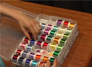
Creating a Unifying Color Palette
Many of your projects involve designs from a variety of sources. Embroidery design colors are largely up to you. With those two things mind, one way to visually tie together the elements of your project is to use a standard set of colors. In this demonstration, I illustrate the process of selecting a unifying color palette for a beach bag tote project.

1:
You might begin by taking a look at the colors suggested for the designs you've chosen. For me, the bright colors of this frame design provided the jumping-off point for my color palette. I knew I wanted to use a bright red, purple, and yellow similar to the ones used in the on-line sample.

2:
Another part of creating the palette is to select other colors from your collection that seem to be in harmony with the tone and shade of the colors which first inspired you. At this point, you may also modify the original color choices – this is a flexible and artistic process! For the beach bag project, I wanted colors that conveyed a light-hearted, sunny, and relaxed feel.

3:
Next, you'll want to make sure there is a color chosen for every design element you will be sewing. It is helpful to print production sheets for each of your designs, which you can use to make note of your color choices.

4:
Sometimes, your color choices will simplify the look of a given design. For example, the flip-flop sole and strap originally suggest two different shades of blue. I decided to sew both color stops using the same blue color, so as to stay in harmony with the bold look of the beach bag project.

5:
A unifying color theme is an effective way to give your project a look of coordinated style.


 Beach Bag Project Design Pack
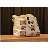 Personalized Beach Bag Tote
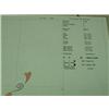 Printing Production Sheets
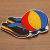 Creating a Unifying Color Palette Video


